
BARENG BARENG
BarengBareng loves to support locals, and here is why: shopping local is important, and BarengBareng wants to support them in any way so that the economy flourishes. It recognizes the superior quality that local businesses offer and their passion for their craft. It seeks out the best quality products to add to its gift selections so customers can share their love in local goods, too.


Coinciding with the expansion of the Bumi Aki restaurant business, which is strategically located in tourist areas, BarengBareng is expected to advance together as one of the destinations for tourists to shop for home-produced goods, ranging from snacks, coffee, chili sauce, clothing and craft to corporate gifts.
We helped BarengBareng define its unique position in the B+ market by designing a catchy, fun and playful identity.
The identity took a form of logotype which was built upon a flexible system — the logotype can be used with supporting graphic elements or independently (stand alone). The color palette was a nod to Sundanese colorful culture.

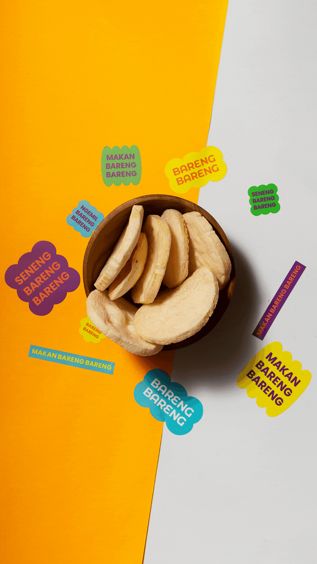
A set of fun, unique and versatile stickers was created to bring the brand to consumers in a way that sticks. The unique combination of geometric shape and fun typography made the product visually attractive and spot-on when displayed at the gift shop. The variety of shapes and colors, in the brand assets, represents a sense of collaboration which ties back to the brand spirit of BarengBareng (meaning togetherness).
Just like the visual elements, the brand voice should extend the character of BarengBareng and as possible convey the spirit of togetherness across all touchpoints.


Discipline
Date
IDENTITY, NAMING, PACKAGING, PRINT
2023