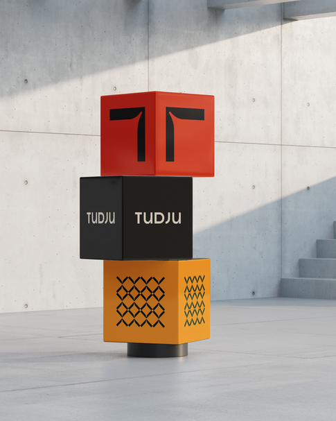
TUDJU SHOPHOUSE
For Tudju, a vibrant shophouse complex, the branding draws inspiration from three core elements that shape its identity. The letter ‘T,’ inspired by both Terogong—the street name—and the location’s unique T-shaped junction, anchors the design firmly in place.


Tudju derived from the Indonesian word tujuan meaning purpose, adds a layer of meaning, representing direction and intention. Together, these elements create a visual language that is both rooted and forward-looking.


The design brings to life Tudju’s lively, modern character. Bold, playful shapes and a bright color palette reflect the fun, energetic atmosphere of the complex. With this identity, Tudju positions itself as a fresh and exciting destination, perfectly suited to the modern lifestyle of its visitors.

Discipline
Date
IDENTITY, NAMING, PRINT, ENVIRONMENT
2023


