
EARTHENTIC
The 20-year-old vegan restaurant found the opportunity to launch a sister brand Earthentic after realizing that millennial consumers had started to embrace plant-based diets.
Using knowledge and wisdom that is passed down through generations, Earthentic aims to put forward a plant-based food culture as a healthier choice of lifestyle.

.png)

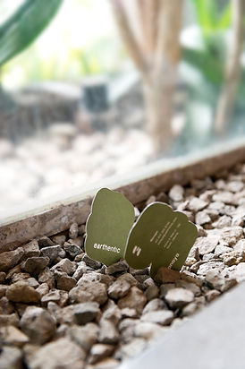
Earthentic’s toned-down color palette is inspired by the rich earthy colors of Indonesian spices and herbs used in the cooking. The logomark was cut out on the menu cover which created a truly personal touch.
Drawing inspiration from the symbolism of the stacked stones in a Zen garden, we designed a logomark of E that exudes simplicity and humility, alongside a contemporary yet organic-like logotype.


The paper bag was designed with a unique illustration of earth elements with minimal outlines to enhance the raw and organic virtues that Earthentic aims to instill through its plant-based food culture.

